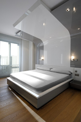
Great interior design for an apartment is absolutely everyone top priority. The Apartment interior by A-cero is no doubt a good inspiration. have a look at the curves and lines. look so straight and well-aligned. Decoration has been resolved with neutral colours combined with some red or yellow. Floors are made of different materials: travertine marble, wood and porcelánico dark gray,
The furniture (designed by A-cero) is grey, black or white and has clean and modern lines. In bedrooms, furniture is made of organic shapes that cover corners with sinuous curves. Bathrooms and kitchens are totally equipped. They have been designed looking for the maximum functionality in order to answering appropriately to the needs that demand these home areas demand everyday.
Via 


Tuesday, March 8, 2011
Apartment Interiors by A-cero
Labels: Interior Design
Posted by idahalang at 7:25 AM 0 comments
DMH Residence by Mim Design
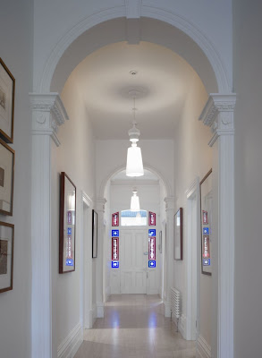
The astonishing design is truly a mind blowing art work. Mim Design is absolutely inspiring whoever sees it. The Victorian features throughout the home have been simplified to a clean, fresh palette whilst maintaining all of the existing elements. The interior furnishings work in conjunction with the space to create an elegant, timeless, fresh feel.
This project distinguishes between old and new with a clean, timeless interior renovation melding with a classic Victorian character.
Via
Labels: Interior Design
Posted by idahalang at 6:55 AM 0 comments
Thursday, December 17, 2009
Interior Design by Jerry Jacobs Design
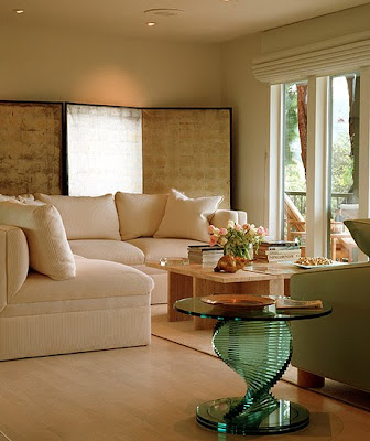
Jerry Jacobs is one of a leading interior design company which always comes up with a fresh and stunning idea in decorating. The interior design by Jerry Jacobs design will bring us to a paradise on earth. Have a look at the details of the following living room interior, the kitchen, the bathroom, and the bedroom. The interior design of those rooms are really distinct work of arts.
The Dining room above has a classic taste that makes it look luxurious and classy.
Now pay attention to the above bedroom interior design. If you have a house you want to make a hotel-like design, it is probably a good reference.
Look at the above living room interior design, it has a huge book shelf makes it look like a comfortable library.
source:Jerry Jacobs design
Labels: A classic-modern interior design
Posted by idahalang at 3:18 PM 0 comments
Friday, October 2, 2009
Interior design collections of Caroline Paterson
The way she combines abstract with tradtional so seemlessly is a delight. Nothing appears out of place or random. Not to mention the designed look.
Caroline’s style can best be described as eclectic and versatile, with the foundation of her inspiration based predominantly on architecture, about which she cares deeply. She enjoys the contrast of working on contemporary interior design projects as much as traditional and whilst at Colefax, spent many years working on corporate projects.


Thrilled is how I felt when I came across the portfolio of London designer, Caroline Paterson. Named by House & Garden to their Top 100 decorators list, I find her work inspiring and the attention to detail amazing. The first picture makes me swoon - love the blue/green silk pillow and hand blown glass vase paired with the contemporary styling of the bureau and the traditional artwork.
source:Caroline Paterson
Labels: 21st Centur Modern Interior house design
Posted by idahalang at 9:42 PM 0 comments
Unbelieveable interior design by Jerry Jacobs
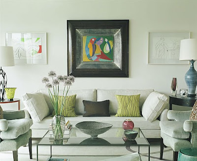
I love the soft palatte punctuated by the strong piece of art and the dark floors and chandelier. Trained as an Architect, a certified Interior Designer, 20 years of design experience and projects in 30 states, England and Mexico, provide an in depth view of the project. I like to think there are no problems, only solutions. We are involved from inception to completion when possible, using good communication, CAD and hand drawings and excellent project management.
Winner of the San Francisco Decorators Showcase and House Beautiful's "Showhouse Room Award", for design excellence, and featured in Architectural Digest, Vogue, Casa-Vogue, House Beautiful, Shelter Interiors, Sunset, N.C. H. & G.
The combination of textiles definitely gets my attention without becoming a distraction. I asked Jerry about the project – I was so curious about that painting – was it the inspiration or the final complement? “The homeowner had seen the painting early in the process and asked me if I could work with it. To me it looked like a modern Toulouse Lautrec… also I have always liked red, black and white motifs, so I said yes. She purchased it and we did work around it a bit.” Jerry said he insisted on the black frame to match the floor and chandelier. At the client’s request, yellow was selected as the primary color, which worked well with the girls’ hair. I admire the restraint excercised in this room – I asked Jerry how he knows when he’s finished. “I am usually very restrained, I find that it makes interiors last longer or become timeless. I tend to be monochromatic, but I do like to bring life into the spaces. In this case natural light worked very well too.”


They specialize in total solutions for busy clients. From an elegant pied-a-terre to a multi-million dollar property, They provide all the services you need, as required. They also do consulting if that is all the client needs. They always accommodate their clients.
source: Jerry Jacobs
Labels: 21st Century Modern Interior house design
Posted by idahalang at 9:25 PM 0 comments
Best interior design by Amanda Nisbet
Best interior design below shows us a stunning works of art by Amanda Nisbet. For those who search for inspiration for their interior design might find this few example useful.

Amanda Nisbet founder of Amanda Nisbet Design, Amanda believes in keeping both her company and number of projects small thus affording her control and commitment to each project. Her understanding of each of the families she works with is the parti for the unique palette of colors, finishes and solutions which define each project.
source: amandanisbetdesign
Labels: 21st Century Modern Interior house design
Posted by idahalang at 9:14 PM 0 comments
Friday, July 17, 2009
Natural modern interior design by Iwan Baan
Combining modernity and nature is obviously not an easy idea to bring to life but Iwan Baan has come up with a brilliant idea. have a look at the following interior design pictures. they are just so perfect and completely new.
Here’s new office design by Iwan Baan, the Selgas Cano architectural offices, its an amazing design concept, this building have the low impact into the landscape, and look like a modern cave. Personally I like this office design, its sleek, simple and have stunning interior with minimalist furniture and yellow white color combination, very inspiring.


source: Iwan Baan Archdaily
Labels: 21st Centur Modern Interior house design
Posted by idahalang at 1:51 AM 0 comments


